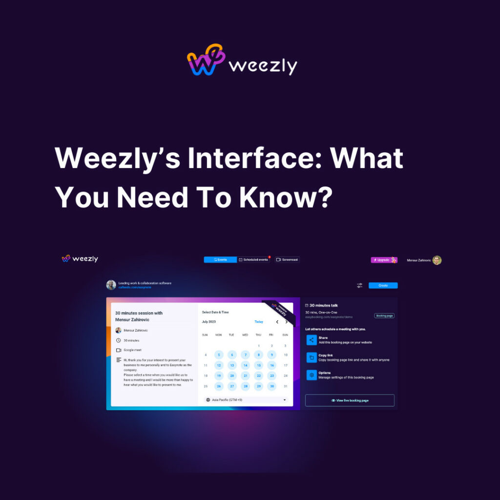
With the digital transformation of the business world, the need for tools that streamline communication and scheduling is more significant than ever. Enter Weezly: a revolutionary tool that marries the capabilities of Calendly and Loom, two giants in the industry. Recently, Weezly unveiled its fresh, user-friendly interface. Let’s dive deep into the new look and Weezly’s interface and understand what it brings to the table.
Weezly’s Interface: First Impressions
Unveiling a new look is always risky, but Weezly’s upgrade is anything but a mere facelift. It’s a strategic move, aligning with the user’s needs and the market’s pulse.
Unveiling a new look is always risky, but Weezly’s upgrade is anything but a mere facelift. It’s a strategic move, aligning with the user’s needs and the market’s pulse.
- Intuitive User Interface: The home page boasts a minimalist design, focusing on what’s essential. It allows both newbies and veterans to navigate through the platform effortlessly.
- Dynamic Color Palette: Gone are the days of monotonous color schemes. The new palette is vibrant yet soothing, reflecting the modern tastes of today’s professionals.
- Enhanced Accessibility: With feedback from a diverse user base, Weezly has ensured that its platform is now more accessible, catering to individuals with various needs.
Let’s Break Weezly’s New Look Into a Few Steps
Weezly’s new look is simple, functional, and logical. The first changes are already visible from the first steps when signing up. So, let’s go through all the steps and the new look together.
#1 Step: Sign Up
When you open any page on the Weezly website, find the Sign-Up and click on it.
#2 Step: Welcome to Weezly
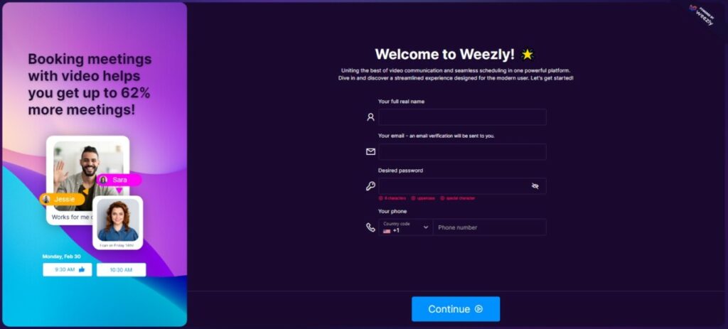
A window like this will open. Fill in the information requested from you, name, email, pass, and phone (optional).
#3 Step: Personalize Your Booking Page
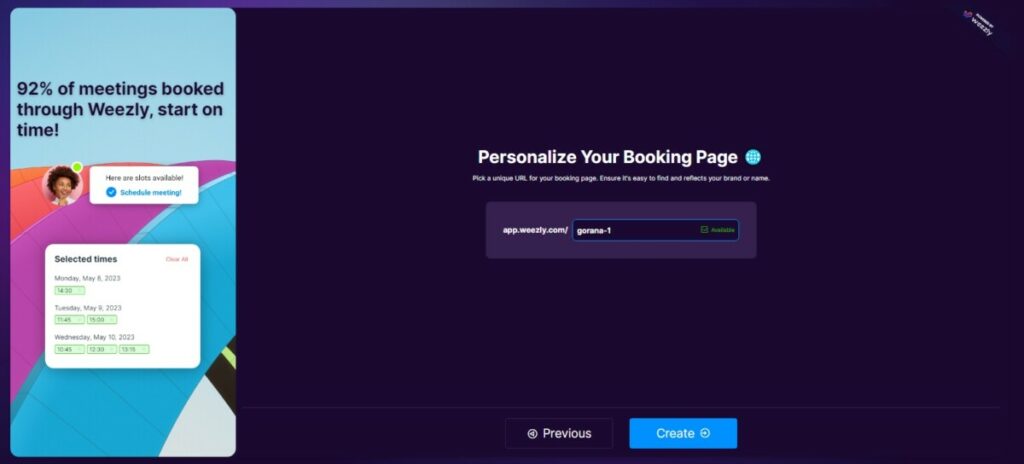
Yes, it’s true. You create your booking page at the very beginning. Before that, you can choose how to personalize it. Enter your or your brand name to get your booking page personalized.
#4 Step: Sync Weezly With Your Calendars
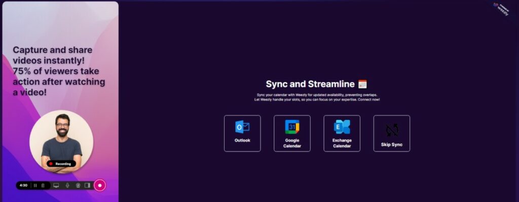
You can immediately sync your Weezly account to your calendars so that you can easily create a booking page and ensure that you have all the tools connected.
#5 Step: Creating Your Booking Page
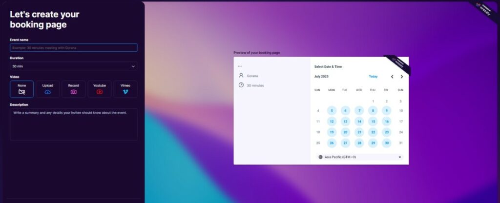
And finally, we came to the creation of the booking page. Enter all information, and video (optional) and create your first booking page quickly and easily.
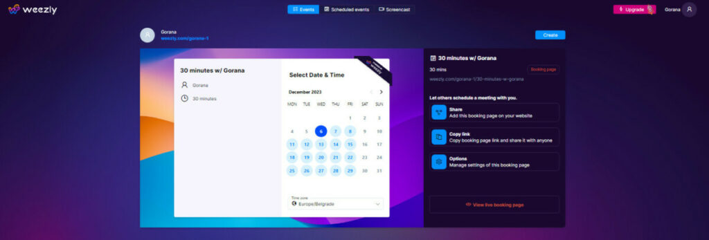
#6 Step: That’s It – Congratulations, You Are In!
Why the Change?
The digital landscape is ever-evolving. To stay ahead in the game, companies must adapt and innovate. With user feedback and market analysis, Weezly realized the need for a more holistic solution. This new look isn’t just about aesthetics but about enhancing the overall user experience.
Key Takeaways: About Weezly’s Interface
- The new onboarding is intuitive, vibrant, and accessible.
- Enhanced features offer integrated video messaging, instant notifications, embeddable widgets, and customized video templates.
- The revamped onboarding process ensures users can maximize the platform’s potential.
In conclusion, Weezly’s new look is not just a change; it’s an evolution. It reflects the company’s commitment to offering the best of both Calendly and Loom, with an added flair of innovation. For those who are already a part of the Weezly family, the change is invigorating. And for newcomers, there’s never been a better time to embark on this journey. Join the revolution and experience the future of communication and scheduling with Weezly.

