Weezly is back with a refreshed look and exciting new Weezly’s features that promise to make your scheduling experience even better. In this in-depth blog post, we will explore these new features in detail, including the updated user interface and the powerful filtering options that will simplify your navigation.
So, let’s dive right in!
The New Look: Aesthetic & User-Friendly
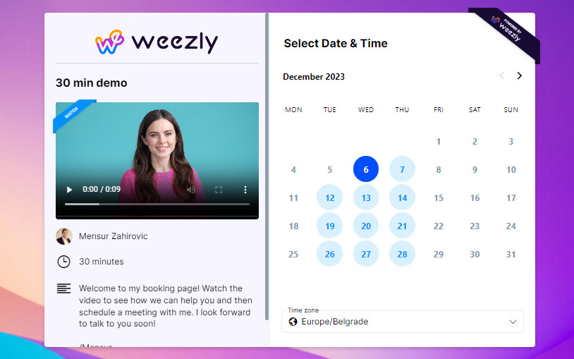
First impressions matter, and the new Weezly interface certainly makes a striking one. The team behind Weezly has put a lot of thought and effort into updating the platform’s design to ensure a seamless and visually pleasing user experience. Here’s what you can expect from the new look:
1. Modern & Intuitive Design
The updated design is modern, clean, and intuitive. The interface is more user-friendly than ever, making it easier for both new and existing users to navigate and utilize the platform’s features efficiently. The use of whitespace and a well-thought-out color palette enhances readability and overall aesthetics.
2. New Names For Events
In order to make your experience and daily use as simple as possible, events in Weezly now have new names. Let’s see the names and an explanation of each:
Booking Page
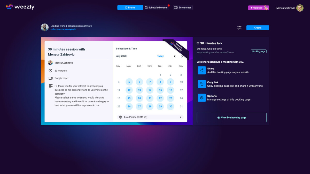
In Weezly, you can quickly create your unique booking page. Simply enter your availability and all the required information.
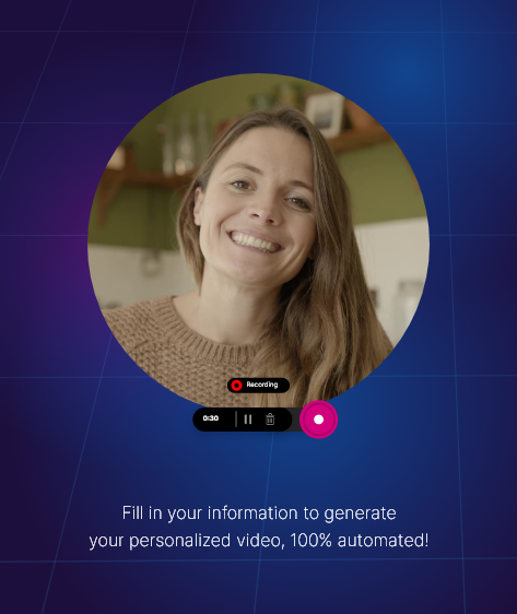
You can also add a video to your booking page in which you introduce yourself and invite people to make an appointment with you. Isn’t that great?
Timeslot Picker (One-off Meeting)
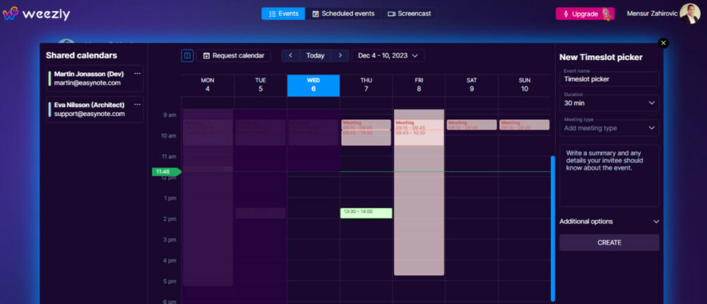
If you want to send the suggested timeslots to another person to choose, the timeslot picker is the best option.
Group Invite (Meeting poll)
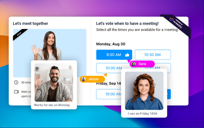
In Weezly, you can also create group invites or meeting polls. Send timeslots and see which ones suit your team members best. This way, you’ll save a lot of time and energy and reduce back-and-forth emails.
Website Widget
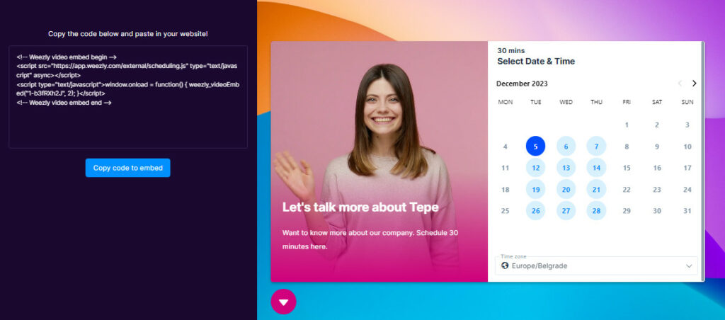
What makes Weezly the most different from all of them is the video widget or the website widget. You know how it works?
In callingdo, you can add a video as you wish, preferably one in which you introduce yourself and invite to a meeting. You can add that video to booking page and upload it directly to your website.
3. Streamlined Navigation
Navigation has been simplified, with essential functions prominently placed where you need them. Whether you’re creating a new event (appointment), managing your videos, or accessing your settings, you’ll find that everything is just a click away.
4. Multiple Filter Categories for Simpler Navigation
Weezly now allows you to filter your events by multiple categories, including:
- Booking Page
- Timeslot Picker (One-off meeting)
- Group Invite (Meeting poll)
- Website widget

Our filter allows you to adjust the preview in a way that suits you best. Choose to see everything or just the booking page or another category.
5. Enhanced Event Visualization
Events and appointments are now displayed in a more visually appealing manner, making it easier to differentiate between various types of commitments. Color coding and icons help you quickly identify the nature of each event, whether it’s a booking page, a one-off meeting, or a group invite.
Why Weezly’s New Features Matter
Now that we’ve delved into the details of Weezly’s refreshed look and filtering options, it’s essential to understand why these features matter in the grand scheme of managing your time and appointments effectively. Here are some compelling reasons why you should explore and embrace these changes:
1. Increased Productivity
Cluttered and disorganized events in a tool can lead to wasted time and missed appointments. With the new filtering options, you can quickly locate the events that require your attention, increasing your overall productivity.
2. Better Time Management
By being able to filter your events by priority, you can ensure that your most critical tasks and commitments are always in focus. This results in better time management and a more structured workday.
3. Enhanced Collaboration
For businesses and teams, the ability to filter events by participants and type is a game-changer. It simplifies collaboration by allowing team members to access the events relevant to their roles and responsibilities.
4. Personalization
Customizable themes and filters allow you to tailor Weezly to your specific needs and preferences. This personalization enhances your overall user experience.
5. Stress Reduction
A clutter-free and well-organized tool can significantly reduce stress and anxiety associated with managing a busy schedule. Weezly’s new features aim to create a more serene scheduling environment.
Final Thoughts
Weezly’s new look and filtering options represent a significant step forward in the world of online scheduling and calendar management. The modern, user-friendly interface coupled with the powerful filtering system empowers users to take control of their schedules like never before. Whether you’re an individual looking to stay organized or part of a business or team that relies on efficient scheduling, Weezly’s new features have something to offer.
Remember that Weezly is not just a scheduling tool; it’s a platform that listens to its users and continuously strives to improve.
So, why wait? Explore the new Weezly features today and experience the difference for yourself. Stay organized, boost productivity, and make the most of your valuable time with Weezly’s refreshed look and filtering options. Your schedule has never looked better!

