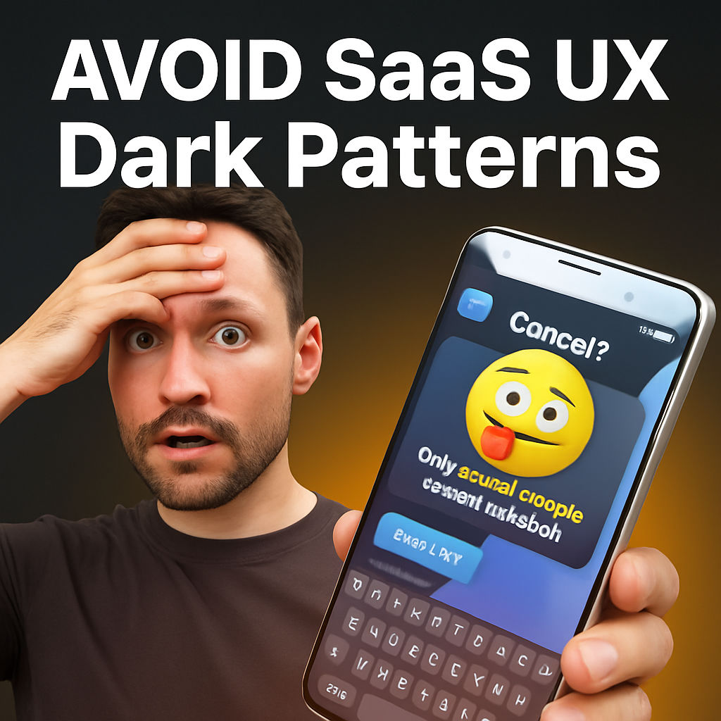
Every internet user has come across user experiences that feel just a bit too manipulative. Maybe you’ve struggled to cancel a subscription, found surprise fees in your shopping cart, or felt a subtle nudge to choose the pricier plan. These tactics — known as dark patterns — are everywhere, and as SaaS businesses grow, the line between clever design and outright manipulation can get blurry.
This guide explores seven common dark patterns in SaaS, revealing how they’re used, why they work, and crucially, where the ethical boundaries lie. Whether you’re a SaaS founder, product designer, or simply want to recognize these tactics as a consumer, understanding the nuances of dark patterns helps you create better, more transparent experiences—and avoid costly customer backlash.
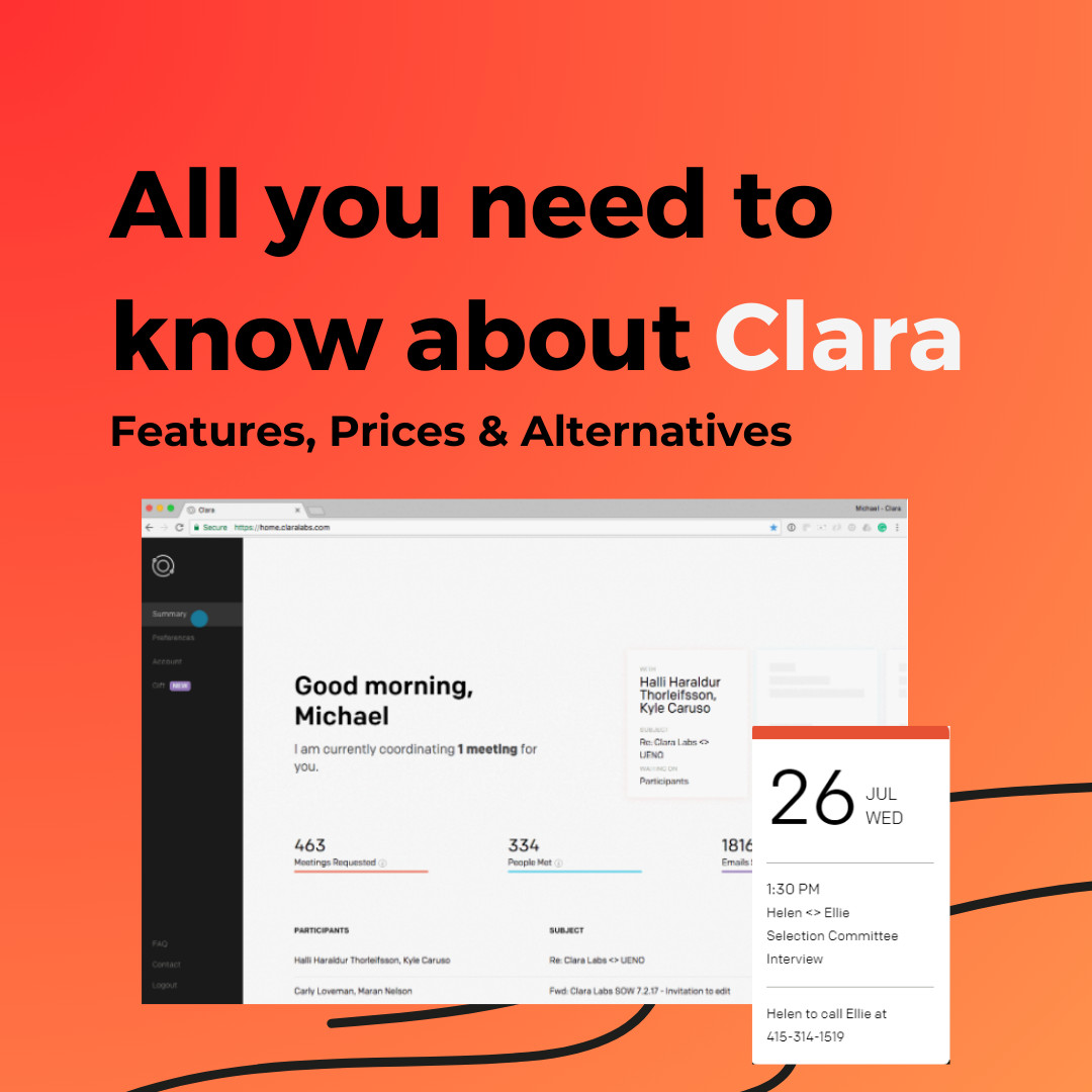
Based on the original video:
Understanding Dark Patterns in SaaS
The primary topic keyword here—dark patterns in SaaS—describes a range of questionable interface and business tactics used by software providers. They’re strategies that persuade, trick, or nudge users into actions they might not freely choose, typically in favor of the business.
But not all “persuasion” is evil—many growth and onboarding strategies lie in a gray area. The goal for ethical SaaS brands: know where the line is, and stay on the right side of it.
1. The Roach Motel: Trapping Users in Subscriptions
The notorious Roach Motel pattern makes signing up effortless, but getting out an exercise in frustration. Many SaaS and subscription services use this design, deliberately concealing or complicating cancellation:
- Hiding the cancellation button deep within labyrinthine account settings
- Triggering a cascade of pop-ups: “Are you sure?” “Would you like a discount?” “Can we call you?”
- Only allowing cancellation via phone calls during limited support hours
- Requiring multiple forms of identity verification and surveys
Why do businesses go this route? Retaining customers is lucrative—but at what cost?
- Key takeaway: Making onboarding easy while throwing up walls during cancellation breeds resentment and negative word of mouth. If your SaaS product requires effortful exit, you’ll likely face customer backlash and damage to your brand reputation.
2. Pre-Selected Settings: The Sneak-In Agreement
Have you ever been flooded with promotional emails after a single purchase, or found yourself signed up to several newsletters you never consciously joined? This traces back to pre-selected options, where businesses check boxes for you (often in your disfavor):
- “Yes, sign me up for partner offers”—already ticked
- Allowing data sharing by default, not by explicit opt-in
Research proves we default to inertia: when pressed for time, we rarely uncheck boxes. This is why so many sites rely on default opt-ins for newsletters, marketing emails, or sharing data with third parties.
For many SaaS providers, onboarding emails are essential—but the ethical line is transparency, easy unsubscribes, and relevance. Bombarding new users with irrelevant promotions or sharing their data without clear consent is not just bad practice—it can be illegal in jurisdictions like the EU.
Ethical Use of Defaults in SaaS
It’s reasonable for a SaaS business to send onboarding instructions or ask for feedback, but defaulting users into extra marketing drifts into dark territory. The best practice is a single-click unsubscribe, visible in every email.
3. Hidden Costs & Drip Pricing: The Price Reveal Trap
Another pervasive dark pattern is drip pricing, where costs appear transparently only as you get closer to purchase. Whether it’s surprise taxes, shipping, usage fees, or “necessary” add-ons, these hidden costs appear just before you hit “Buy Now.”
- Advertised plans may not include key features (e.g., logging, analytics, premium support), with the true price revealed only via complex pricing calculators or after signup.
- Usage-based models might look cheap upfront but may result in unpredictable monthly bills.
Especially in technical SaaS (think cloud hosting or developer platforms), complex documentation and calculators bury essential costs. Small business owners and startups are hit particularly hard, causing frustration and budget overruns.
For example, a cloud hosting plan may show an attractive monthly fee. But transmitted data, regional network gatekeeping, and longer-term log storage each add incremental fees—sometimes only discovered on the final invoice.

Some SaaS providers use a simple, clear tier system—what you see is what you pay. Others heavily promote budget plans, only to reveal limitations and push upgrades mid-use. Ultimately, the most customer-centric approach is clear, upfront communication about every cost, add-on, or restriction.
If you’re interested in how different pricing models compare, especially for fast-growing platforms with automation features, see this in-depth analysis: La Growth Machine Pricing: Ultimate Guide to Cost & Value.
4. Forced Continuity: The Free Trial Gotcha
This familiar tactic starts when a user signs up for a free trial with their payment information. After the trial period, with or without explicit reminders, the user is automatically billed for a paid plan. The nuances make all the difference:
- Is it abundantly clear (not just buried in the fine print) that payment is required after the free period?
- Are reminders sent (via email or platform) before the trial ends?
- Is it easy to cancel, or does the user have to navigate a maze?
- Is there a fair refund policy in case of mistaken upgrade?
Gathering credit card info upfront weeds out spam or unserious users, but withholding critical information or reminders is what makes this pattern “dark.”

Ultimately, transparency is key. Users should know exactly when and how much they’ll be charged, and have the chance to opt out without hurdles.
5. Confirm Shaming: Guilt as a Conversion Tool
“Are you sure you want to cancel? Don’t you want to keep your business streamlined?”
Or worse: “Cancel, I prefer wasting my time.”
This is confirm shaming, a pattern that uses emotionally loaded or guilt-inducing language to persuade users not to opt out, downgrade, or cancel. While offering a last-minute incentive can be acceptable, crossing into personal insults or deliberate shame is a recipe for lost trust.
Some businesses employ gentle nudges with a touch of humor or cheekiness—which, when done with care, may not cause offense. But if you consistently frame user choices as “stupid” or “wrong,” you walk directly into the dark pattern territory.
When (and How) to Use Confirm Shaming Responsibly
A soft emotional appeal (“Are you sure? You’ll lose access to these features…”) may be warranted, but it should never insult the user’s intelligence or autonomy. Always provide a simple, no-shame way to decline or opt out.
6. Feature Overload: Paralysis by Complexity
The modern SaaS landscape is rich with features, integrations, and customization—but too much choice can cripple decision-making. Feature overload bombards users with so many plans, toggles, settings, and technical jargon that they feel overwhelmed (also known as analysis paralysis).
- Overloaded pricing pages with subtle but confusing plan differences
- Default “recommended” options pre-selected to favor higher-tier sales
- Abundant technical options that matter little to the average user’s needs

Oftentimes, a user—confused and unsure—will stick with the default choice, which conveniently aligns with the provider’s financial interests. While offering choices can be good, the ethical line is crossed when excessive options are designed to confuse rather than empower.
7. Manipulative Framing: Trust and Authority, Used Against You
Manipulative framing shapes how users perceive options by exploiting trust or mimicking data-driven recommendations. Common examples:
- Ad platforms auto-suggesting a “recommended” spend that’s not actually optimal for your goals
- Pricing pages labeling a particular plan as “most popular,” regardless of real usage data
- Manipulating statistics or notifications to nudge you toward upsells
While sometimes these recommendations are genuinely based on customer needs, too often they’re engineered to push users toward pricier or higher-margin options—regardless of what benefits the customer most.
Staying on the Bright Side: Honest UX and Customer-Centric Design
The difference between good marketing and dark patterns often comes down to intent, clarity, and respect for the user:
- Are you empowering users with honest choices, or boxing them into those you benefit from most?
- Are your upsells and recommendations transparent, substantiated, and genuinely useful?
SaaS companies that aim for long-term trust and loyalty should focus on clarity, fair consent, and true value—not quick wins through manipulation. As regulations and user awareness grow, transparent design isn’t just ethical; it’s a business imperative.
Where Is the Line? Navigating the Gray Areas in SaaS UX
As a SaaS business owner or designer, it’s easy to justify certain patterns out of competitive necessity. After all, many practices that begin as clever optimizations can turn dark in overuse. Here’s where nuance matters:
- Retention tactics: It’s acceptable to gently ask why users leave or offer a legitimate incentive. But making cancellation hard, or shame-based, is unethical.
- Onboarding flows: Streamlined signups are great—but never at the cost of hidden agreements or unclear post-trial charges.
- Pricing transparency: Layered optional features are fine, as long as their impacts are transparent and honest from the start.
Ultimately, your SaaS’s reputation depends on user trust. It’s possible to drive conversion and retention through good UX and value—not by making your customers resentful or trapped. Looking to compare how leading scheduling tools stack up on usability, features, and transparency? Our Weezly vs Acuity: Detailed Comparison post breaks down the pros and cons.
Actionable Steps: Building SaaS Trust Without Dark Patterns
- Audit your UX: Routinely review signups, cancellations, and upgrade flows
- Simplify pricing: Use plain language, upfront costs, and clear feature matrices
- Be transparent in communications: Send reminders, explain upcoming charges, and avoid misinformation in pop-ups, recommendations, and email campaigns
- Offer real feedback channels: Invite honest feedback—without guilt tripping or trick questions
While SaaS is a hyper-competitive space, sustainable growth comes from trust, fairness, and user-centric innovation—not short-term wins through manipulative design.
FAQ: Common Questions About Dark Patterns in SaaS
What are dark patterns in SaaS?
Dark patterns in SaaS are user interface or business tactics designed to manipulate users into taking actions that favor the company—such as making it hard to cancel, hiding fees, or using guilt to prevent churn. They often appear as deceptive sign-up flows, default opt-ins, or misleading pricing models.
Is it ever ethical to use dark patterns to boost SaaS conversions?
While some gray-area tactics (like gentle reminders or suggested plans) can be legitimate, intentional confusion, guilt-tripping, or hidden charges cross into unethical territory. The best SaaS companies grow through transparency, clarity, and respect for user choice.
How can SaaS companies ensure their designs are ethical?
Regularly testing user flows for clarity, minimizing hidden default options, explicitly communicating pricing and cancellation policies, and inviting user feedback without manipulation are all key practices for keeping SaaS UX ethical.
Are dark patterns in SaaS illegal?
Some dark patterns—particularly those involving data privacy, pre-selected consent for marketing, or intentionally obscured cancellation—are illegal under laws such as the GDPR in the EU. Others may result in penalties from regulators or payment processors.
What should users do if they encounter a manipulative SaaS experience?
Users should provide candid feedback, use available unsubscribe or opt-out mechanisms, and if necessary, report illegal practices to consumer protection agencies. Advocating for better practices helps raise industry standards over time.